The color desk
How to Wear Red and Pink Without Looking Too Sweet
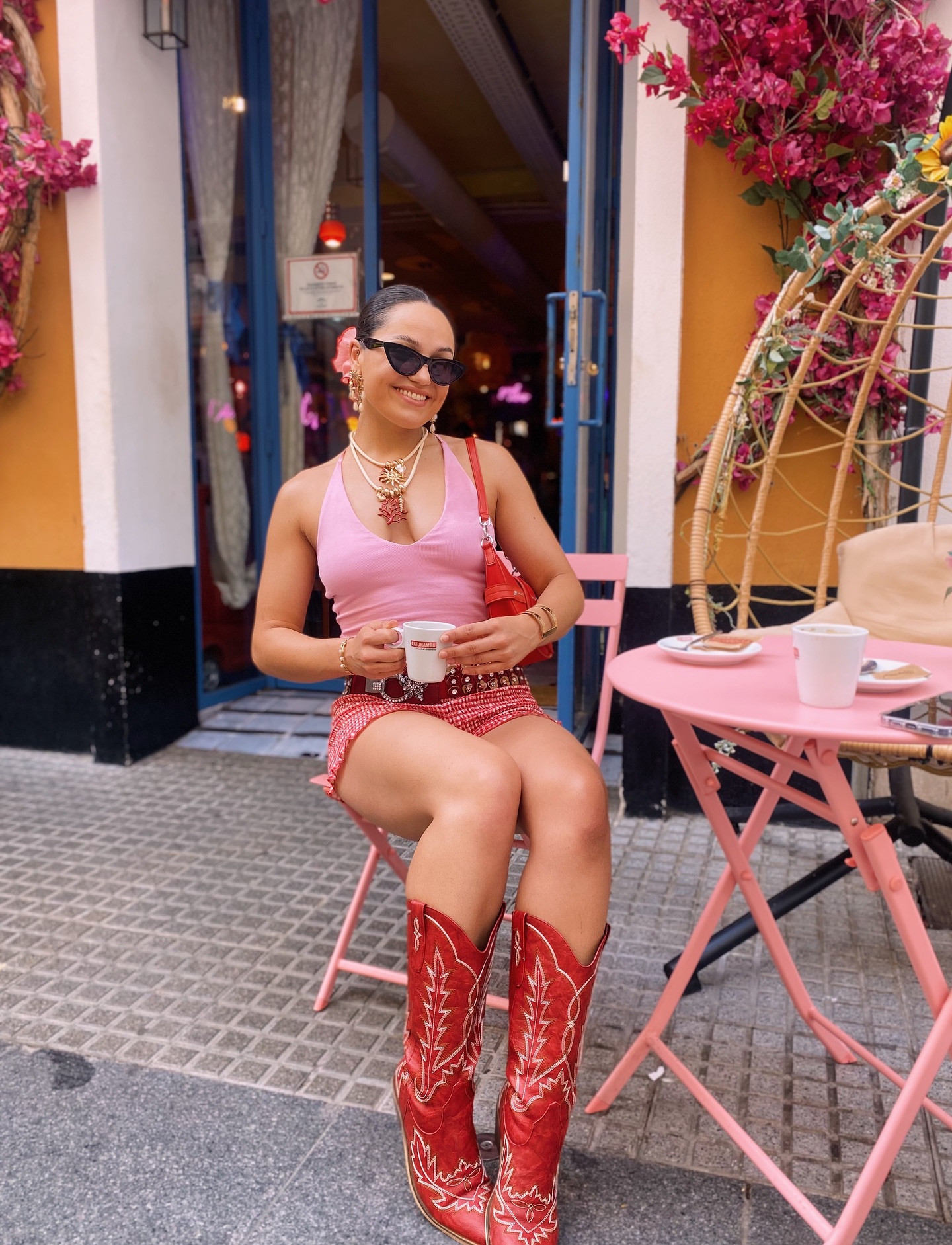
The combination is already confident. Give it hierarchy, sharper materials, and one grounded neutral so it reads intentional rather than confectionary.
 By Clara Whitmore
Updated July 14, 2026.
Can red and pink look polished together?
Yes. The useful question is which red, which pink, and which one leads. Give the colors distinct roles and the result works at an office, a dinner, a wedding weekend, or an ordinary Saturday.
Adobe’s color framework describes analogous colors as neighbors on the wheel and monochromatic palettes as variations derived from one base. That makes red and pink close relatives, not opponents. Their proximity creates cohesion; a change in lightness, temperature, or scale supplies the distinction.
The one decision to make first
Choose a dominant color. Diana Walker, visual content designer with Adobe Express, says color should support hierarchy, clarity, and cohesion. Adobe published that guidance May 28, 2026. Translation: keep the combination, then control it.
Build a tonal pair, then ground it
Start with undertone. A warm tomato or poppy red looks coherent beside coral, salmon, and peach pink. A cool cherry or cranberry red works more cleanly with rose, raspberry, and fuchsia. If you cannot name the undertone, place both pieces beside plain white paper in indirect daylight. The warmer one will look slightly orange or yellow; the cooler one will lean blue.
Red leads
Use a red dress or trouser as the largest field. Add pink through a shirt, fine knit, or bag. Cream, camel, denim, or chocolate should occupy the smallest share. This is the fastest route to a graphic rather than sugary result.
Pink leads
Let a tailored pink suit, column dress, or poplin shirt dominate. Keep red to a flat, deliberate accent: a slim belt, loafer, bag, or knit over the shoulders. The smaller red area gives the outfit punctuation.
Tonal and saturated
Pair cranberry with raspberry or scarlet with hot pink when you want impact. Use simple silhouettes and two finishes at most. A matte suit with a polished shoe has enough contrast without an extra print.
Dark red and pale pink
Burgundy beside shell pink creates an easier light-dark split. Add charcoal, dark denim, or chocolate for structure. Replace baby pink with dusty rose if the pale shade feels too delicate.
Add contrast without adding chaos
Want the combination to feel less romantic? Bring in a neutral with a different visual character. Dark denim makes red and pink casual. Chocolate brown deepens them. Camel warms them. Ivory creates a clean pause. Black can work, but it often becomes the loudest boundary in the outfit; charcoal is usually quieter.
A square-shouldered jacket, poplin shirt, straight trouser, substantial loafer, or minimal sneaker adds a harder line. Lace, bows, pearls, and glossy pink all at once push the palette toward sweetness. Keep one decorative device.
A quick temperature check
Tomato red + coral pink + camel is warm. Cherry red + rose pink + charcoal is cool. Cranberry + shell pink + chocolate is mixed but balanced by value. These are starting points, not fixed rules.
Four complete red-and-pink outfit formulas
Sharp weekday color
Cherry-red wide trousers + pale-pink cotton shirt + chocolate loafer + brown belt. Red occupies the largest area, while the shirt brings light near the face. Keep hardware minimal. For a cooler finish, replace brown leather with charcoal suede.
Easy weekend layers
Dark denim + raspberry crewneck + scarlet jacket + cream sneaker. Denim is the visual base, so the two bright colors read as layers instead of a complete color block. If scarlet and raspberry are too close in value, make the jacket the darker piece.
Controlled evening contrast
Fuchsia column dress + red pointed flat + oxblood clutch + bare metal jewelry. The dress leads; red stays below the ankle; oxblood deepens the accent. A single polished finish is enough. A black clutch can replace oxblood when the dress has a blue undertone.
Warm-weather separates
Tomato-red cotton skirt + coral-pink tank + camel sandal + ivory overshirt. The open ivory layer creates negative space and softens the saturation. For midsummer, use linen or poplin rather than several shiny fabrics.

Current pieces that can start the palette
These are retail examples, not shade-matched sets. Our editors select the examples independently; Nordstrom did not determine the list. The selected product pages were checked July 14, 2026, but color, regional price, and stock can change. The listed prices reflect Nordstrom’s Taiwan-region view and do not include currency conversion. Compare the garments together before treating them as a pair.
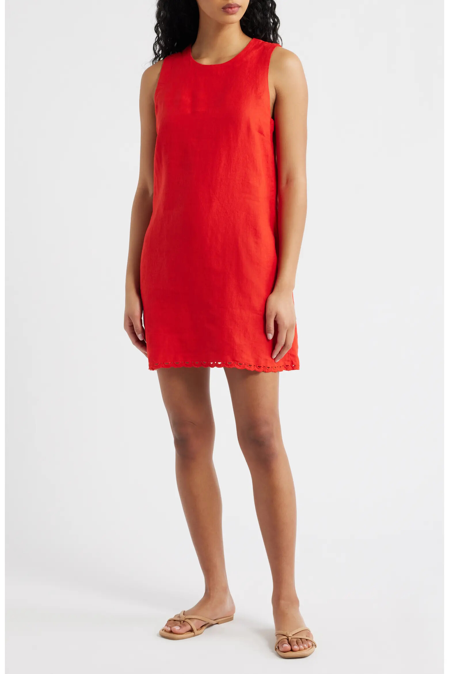
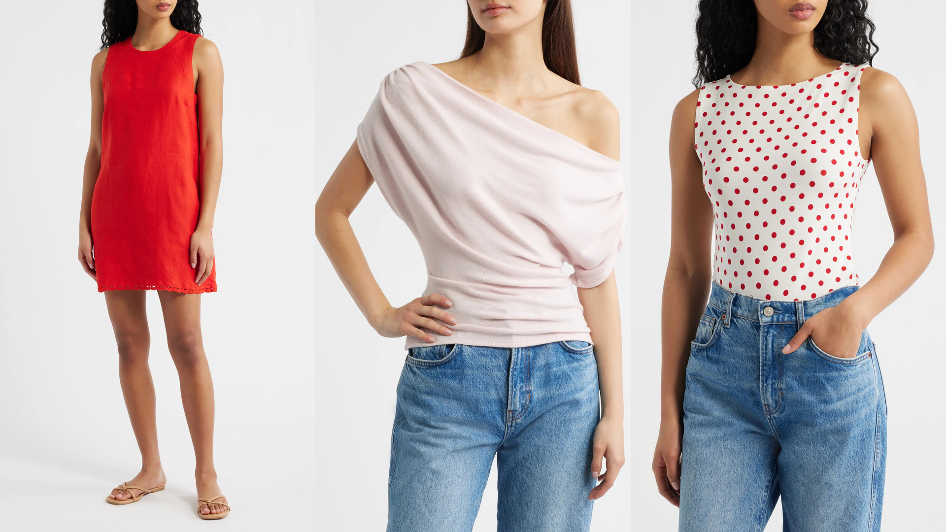
Madewell Embroidered Linen Mini Shift Dress
NT$2,928.47–NT$3,904.63 in Nordstrom’s Taiwan-region view on July 14, 2026.
The 100% linen A-line shift has a jewel neck, sleeveless cut, and embroidered scallop hem. Nordstrom lists it as item #11299954. Its broad Wild Poppy field can lead while a pale-pink shoe, bag, or shirt supplies the smaller repeat.
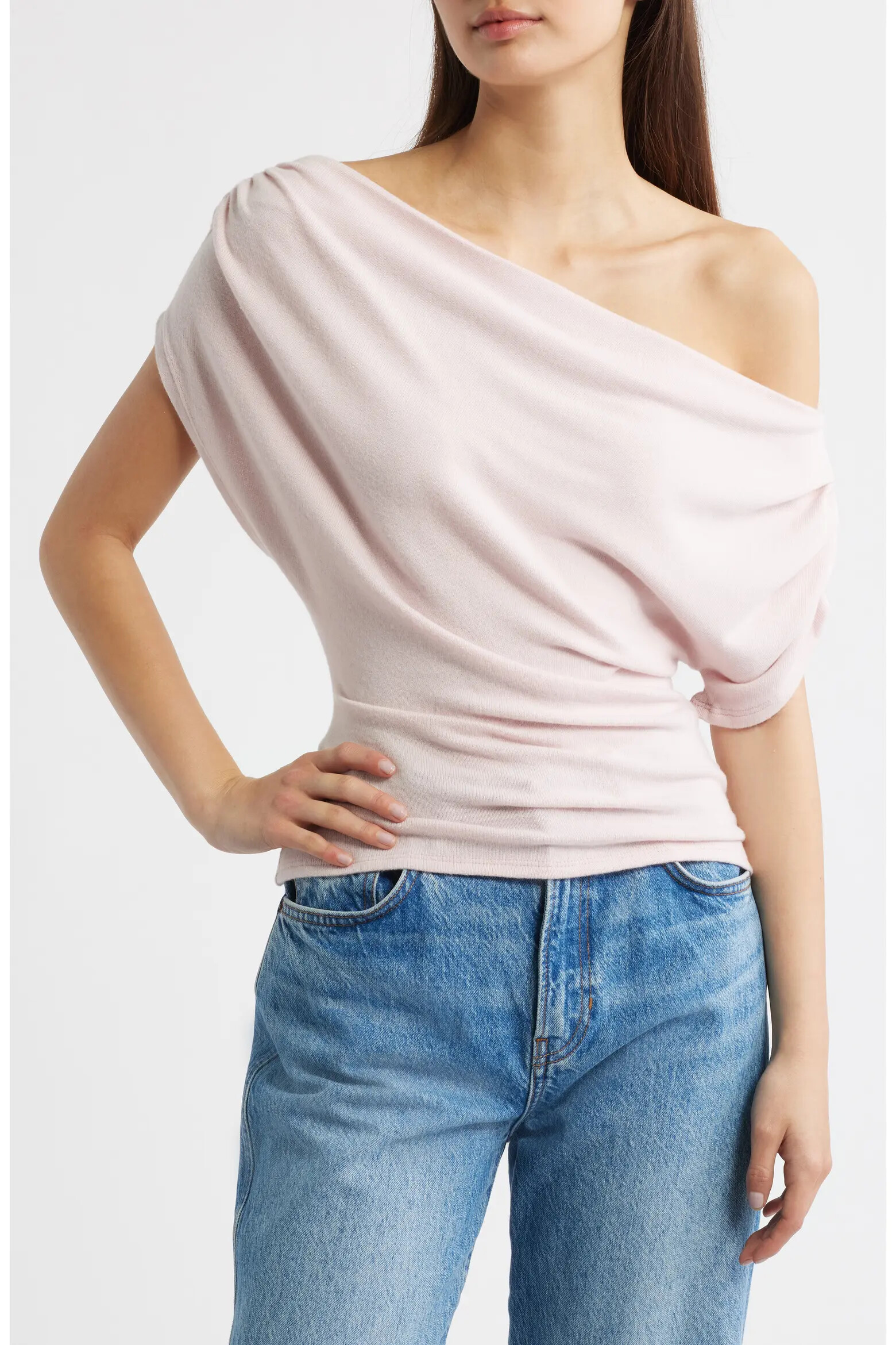
View at NordstromReformation Iris One-Shoulder Knit Top
NT$2,581.03–NT$3,242.83 in Nordstrom’s Taiwan-region view on July 14, 2026.
The gathered one-shoulder top is listed as 67% Tencel lyocell, 29% organic cotton, and 4% spandex, item #11225980. Use Cherry Blossom above a red skirt or trouser so the darker hue controls more of the outfit.
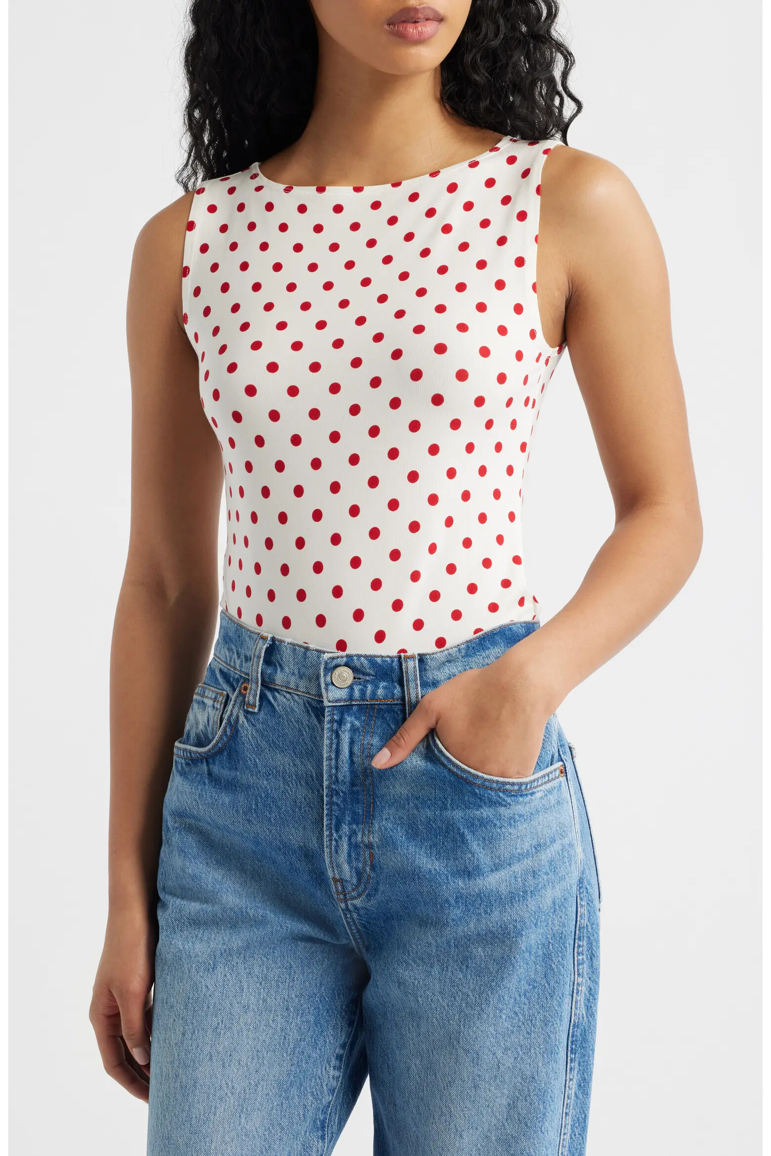
View at NordstromReformation Dusk Stretch Knit Top
NT$1,290.51–NT$2,581.03 in Nordstrom’s Taiwan-region view on July 14, 2026.
The sleeveless bateau-neck top is listed as 88% organic cotton and 12% spandex, item #7657959. Its Ketchup Dot pattern lowers the red area, leaving room for a solid pink layer without creating an equal color block.
View at NordstromExact product-page snapshot — July 14, 2026
- Nordstrom, July 14, 2026: Madewell Embroidered Linen Mini Shift Dress, item #11299954: Wild Poppy, 100% linen, sleeveless A-line shift.
- Nordstrom, July 14, 2026: Reformation Iris One-Shoulder Knit Top, item #11225980: Cherry Blossom, 67% Tencel lyocell, 29% organic cotton, 4% spandex.
- Nordstrom, July 14, 2026: Reformation Dusk Stretch Knit Top, item #7657959: Ketchup Dot, 88% organic cotton, 12% spandex.
The same color test applies to a J.Crew shirt, an Aritzia trouser, or an Eileen Fisher skirt: compare the garment, not its marketing name. A Reformation pink top may supply the right shape, but the retailer’s filter cannot establish its undertone.
Adjust for fabric, lighting, and season
Color does not live separately from material. Satin reflects more light than wool. Cotton poplin draws a firmer edge than fuzzy mohair. Suede absorbs light, while patent leather creates a bright highlight. Two garments labeled “cherry” may look unrelated because their fibers and finishes send light back differently.
According to a report from X-Rite, metamerism can make materials match under one source and separate under another. Check daylight and destination lighting. Keep in mind that cotton, linen, wool, suede, denim, satin, silk, and leather each redirect light differently.
Common pairing mistakes—and better substitutions
- Equal blocks with no hierarchy. Make one hue dominant. Turn the other into a shirt, shoe, or bag.
- Several “cute” signals at once. Keep the color, then replace ruffles with a clean neckline, bows with a belt, or pearls with plain metal.
- Matching by color name. Put the pieces together in daylight. Substitute dusty rose for peach pink, or cranberry for tomato red, when temperatures fight.
- Too many glossy surfaces. Keep satin in one area and switch the rest to wool, cotton, denim, or suede.
- Defaulting to black for every accessory. Try chocolate, oxblood, charcoal, camel, or dark denim first.
The bottom-line palette
- Warm: tomato red + coral pink + camel
- Cool: cherry red + rose pink + charcoal
- Deep: cranberry + shell pink + chocolate
- Casual: scarlet + raspberry + dark denim
Choose the lead color, vary the value, add one grounded neutral, and stop before every detail starts competing.
Our editors select and independently research every product. If you buy through our links, we may earn a commission.